The analytics dashboard displays imported and aggregated data for connected accounts. This overview explains navigation, periods and how to read cards. A metric’s exact definition depends on the platform, report and data basis.
Definitions by platform
| Platform | Using the reports | Individual metrics and calculations |
|---|---|---|
| Instagram Analytics | Metrics glossary | |
| Facebook Analytics | Metrics glossary | |
| TikTok | TikTok Analytics | Metrics glossary |
| YouTube | YouTube Analytics | Metrics glossary |
Data basis and freshness
ContentMate imports platform data regularly in the background, aggregates it and displays it from its own database. Opening a dashboard, switching tabs or changing periods does not trigger a live request to Instagram, Facebook or TikTok.
Distinguish three levels:
- Period activity: Reported actions or observed changes within a time window. TikTok values are derived from imported video totals; an older publication can continue generating activity.
- Publication cohort: Posts published during the period, with their available imported lifetime values. These can include interactions generated after the publication date.
- Snapshot: A count such as followers or an audience distribution. These values are not summed across days.
Today/Yesterday may use an hourly view. An hourly chart does not mean the platform provides new complete data every hour. Import time, aggregation time and data time describe different things. Processing delays, permissions and report limits can leave gaps. The display does not promise real-time data or a fixed six-hour schedule.
Missing is not zero: Zero is a reported or correctly calculated value with no activity. A dash, “Unavailable” or an incomplete series must not be treated as zero in your own calculations.
Choose an account and period
Open Analytics, choose the account at the top, then a section: Overview, Engagement, Community, Reach, Content or All Media. The selected account determines the platform and available metrics.
The period bar offers Today, Yesterday, 7, 14, 30, 90 and 365 days, This year and a custom range. Check the displayed start and end dates. Rolling periods include today and compare with the immediately preceding period of the same length. “This year” runs from 1 January to today and compares with the corresponding part of the previous year. A custom range includes both boundaries, spans at most 365 days and compares with the immediately preceding period of equal length. All Media is labelled as an inventory independent of the period; individual snapshots may also be exempt from the filter.
Not every platform report supports every period. For example, a matching stored total-reach value may exist for a native window but not for a custom range. It is not replaced by adding individual days.
Previous periods, percentages and percentage points
Where a valid comparison is possible: change = (current value − previous value) ÷ previous value × 100. Moving from 80 to 100 gives +25%. If the previous value is missing or zero, an ordinary percentage change cannot be calculated; read the display rather than treating a dash as 0%.
A rate rising from 4% to 5% increases by one percentage point, or 25% relatively. Compare identically defined metrics with comparable completeness. Today and the current month are not yet finished.
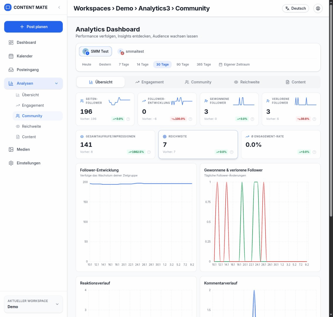
KPI Cards
A KPI card shows a metric and, where available, its comparison value, change and small trend chart. Check data freshness and notices about unavailable or incomplete data. A dash is not a confirmed zero. Not every platform supports every card.
Page Followers
The imported follower total for the displayed reference date, not a sum of daily totals. A count of 1,000 on Monday and 1,010 on Tuesday gives a newer count of 1,010, not 2,010. Facebook Page likes are a separate metric. The latest imported count may differ from the platform’s current display.
Followers Evolution
Facebook uses reported gains and losses: net growth = followers gained − followers lost. For example, 40 gains and 15 losses gives +25. Instagram and TikTok net change is calculated from matching imported follower snapshots: ending count − starting count. A suitable earlier measurement is required. A net change of +25 cannot distinguish 25 gains and no losses from 40 gains and 15 losses. A missing baseline is not replaced with zero.
Gained Followers
Reported new followers during the period, where the platform provides this metric and it has been imported. Do not equate this with positive changes in follower totals: 30 gains and 20 losses increase the count by only 10. A missing gains value does not mean nobody followed.
Lost Followers
Reported losses during the period, displayed as a positive count and subtracted when calculating net growth. An unchanged total does not prove there were no losses: gains may have offset them. TikTok losses are not invented from total counts.
Total Views
The view or display metric belonging to the report. Instagram views, TikTok video views and Facebook media views follow different counting rules. Historical Facebook impressions are a separate metric. Repeat views may count. This is neither a follower total nor a comparable cross-platform count of individual people. Post cards may show a post’s imported lifetime total; period KPIs use their own data basis.
Reach
Reach deduplicated by the platform for a particular report and period, where available. It must not be replaced by adding daily or per-post reach. For example, 100 accounts are reached on Monday and 100 on Tuesday; if 60 appear on both days, combined reach is 140 rather than 200. A matching imported period value is therefore required. The TikTok connection used here does not provide this metric.
Avg Engagement Rate
This card relates interactions to the follower count. For Instagram, Facebook and TikTok it uses interactions in the selected period without an additional post-count divisor. To distinguish the calculations: a period rate is interactions in the period ÷ followers × 100; a per-post rate additionally requires an appropriate per-post average. For example, 200 interactions, 1,000 followers and four posts give a 20% period rate, but 5% on average per post. The rate counts actions, not unique engaged people. The platform glossary explains the calculation used by the display.
Posts
The number of imported published posts whose publication date falls within the selected period. Drafts and posts that are only scheduled are not published posts. Availability depends on the imported inventory and supported formats; posts created in ContentMate are not the only possible source.
Reactions
The imported number of reactions or likes. Facebook may report separate reaction types; Instagram and TikTok use likes. Reaction types do not create an additional count of people. Period values, hourly changes and post lifetime totals may use different data bases.
Comments
The imported comment count. It is not a count of unique commenters and need not equal the number of loaded inbox messages. Deletions, moderation, update timing and different coverage can cause differences. See the platform guide for period attribution.
Shares
The imported number of shares according to the platform’s definition. A share proves neither that a new person was reached nor how many extra views resulted. Sharing, saving and copying a link are not automatically the same action.
Charts
Charts use imported and aggregated data. Check axis units, time granularity and gaps. A daily series, a current total and the lifetime values of published posts are not interchangeable. Percentages and averages must not simply be added across days.
Followers Evolution Chart
The history of imported follower totals. Each point is a count, not a number of new followers. Earlier missing measurements cannot be reconstructed from today’s total; a late start to the series may reflect when importing began.
Gained & Lost Followers Chart
The history of reported gains and losses, where available. Both can occur at the same time. Compare their difference with net growth; do not replace missing losses with zero or read the series as a list of individual people.
Reactions History
Reactions or likes over time at the displayed hourly or daily granularity. When changes are derived from total counts, activity is assigned to the observation window, not the exact time of each like. Compare only values using the same data basis.
Comments History
The comment history at the displayed time granularity. A high count alone does not establish positive sentiment. An old post’s lifetime comment count may exceed the change observed during the selected period.
Recent Posts
The most recently published imported posts and their available metrics. Read card values as post-level values and note any lifetime basis. The period filter and imported inventory determine which posts are included; missing videos or formats are not automatically unpublished.
YouTube comparison
YouTube
- Video views and engaged views are shown separately; views are neither thumbnail impressions nor unique reach.
- Watch time, average view duration, likes, comments, shares, and subscribers gained/lost come from available YouTube reports.
- Subscriber gains and losses are reported daily values, not estimates from changes in the total subscriber count.
- Selected periods are aggregated from imported data. Daily reports use YouTube’s America/Los_Angeles time zone; recent days may still be missing.
- Channel counters and the video overview may contain lifetime totals. Missing or withheld data is not interpreted as zero views.
Understand YouTube analytics explains metrics, data availability, and reports.
Compare values meaningfully
- Compare the same platform, metric definition and period. There is no universal threshold that makes an engagement rate “good”.
- Separate counts, unique reach, total snapshots, averages and ratios. A high number alone establishes neither quality nor a particular cause.
- Check import and aggregation status, account permissions and gaps. An empty view after connecting may be waiting for its first import.
- When values differ from the platform, compare the same account, report, period and data freshness. Historical values may be corrected later.